Recuro Health is dedicated to the idea that together we can and will transform a reactive sick care system into a truly proactive health care platform. At the end of the day, our brand is about putting our members in contact with quality physicians that can tailor each patient’s plan to their individual needs.

Mission Statement
To make healthcare better for people by lowering costs and improving outcomes by making advanced healthcare accessible
Why Our Branding Matters:
Our brand should communicate the same innovation and presence that our members expect of a trusted healthcare company. To help align our identity, we have constructed this brand guide to communicate our shared vision. Our brand should therefore convey 3 core pillars: institutional trust, scientific innovation and healthcare personalization. All fonts, colors, and photos have been chosen to reflect these ideals.
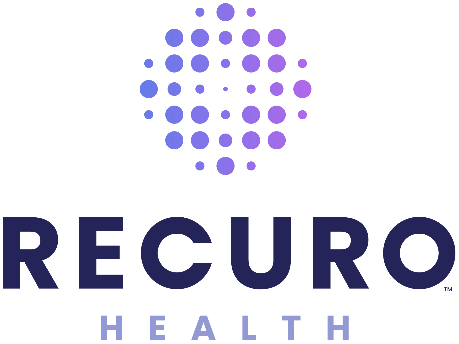
Logos
We use three versions of the Recuro logo that are optimized for various sizes: a vertical version, a horizontal version, and a favicon logo symbol.
Proportions & Scaling
Vertical Logo:
The vertical version of the logo should be used on large-scale implementations, including signage, t-shirts, etc. This logo can also be displayed alone, or within a white circle when applied on top of a dark/complex background.
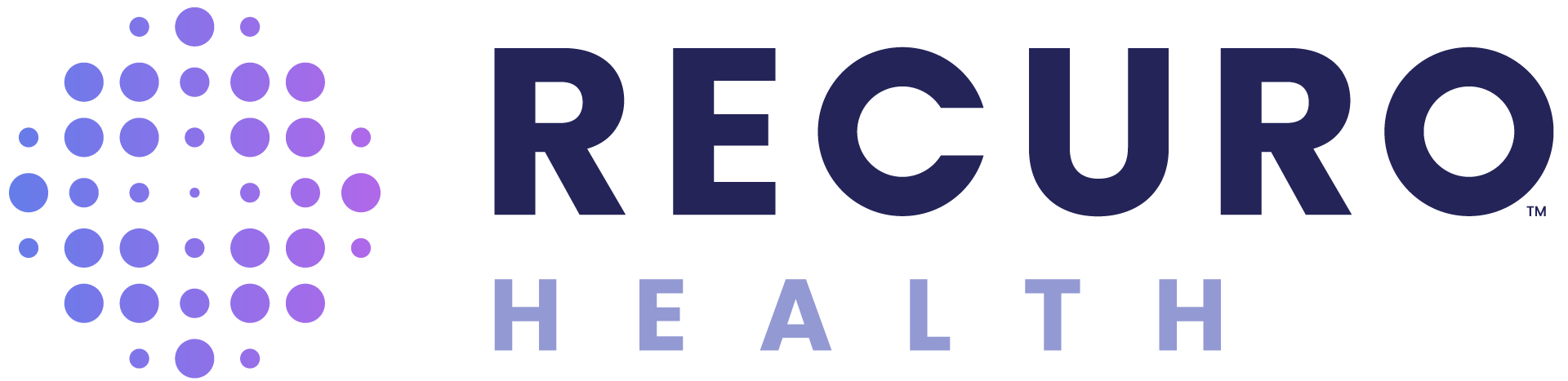
Horizontal Logo:
Use regularly when the vertical logo cannot fit within a given layout. Never scale below 30px.
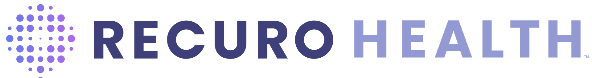
One-liner Logo:
Use only if layout makes absolutely necessary.
Favicon:
App icons & avatars (can be blown up as background treatments).
Partners
As Recuro grows it’s service offerings and members, our organization will naturally need to expand as well. Consequently, all acquisitions or sub-divisions must have some visual identifier that calls upon Recuro’s parent brand. To the right, you will find an example of such treatments.
Cobranding with Recuro
Positioning:
The position of the term “Powered by Recuro” should fit around the existing logo lockup, so long as it maintains a consistent distance as identified by the “A” in the subtext.
Contrast
It is essential that we adhere to web accessibility standards when using our palette. We adhere to AA standards. Located to the right are AA approved variations of how the Recuro logo should be treated on a light-to-dark gradient scale. Essentially, all logos and fonts applied ontop of a light background should use dark treatments. Whereas, all logos and fonts applied onto of a dark background should use light treatments to provide contrast.
Logos & Accessibility
Light Backgrounds:
Pay close attention to the contrast ratio created when placing our light logo on top of a dark background. You want to ensure that there is enough distinction between the background and foreground elements
Dark Backgrounds:
For dark backgrounds you may either use the full white or dual-tone white logos. It is critical that the gradient in the logo symbol not blend into the surrounding background color. Use the full white logo when in doubt.
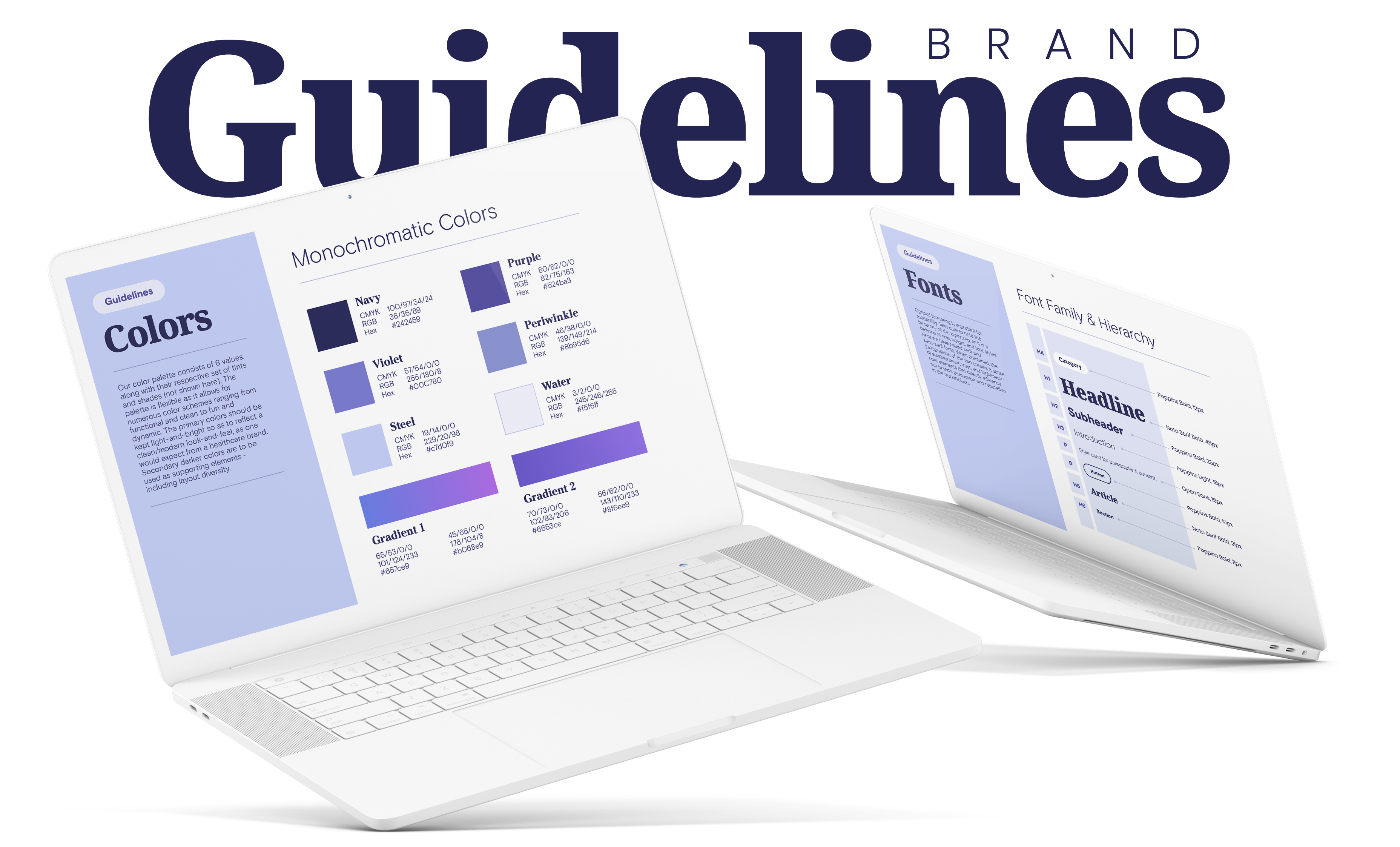
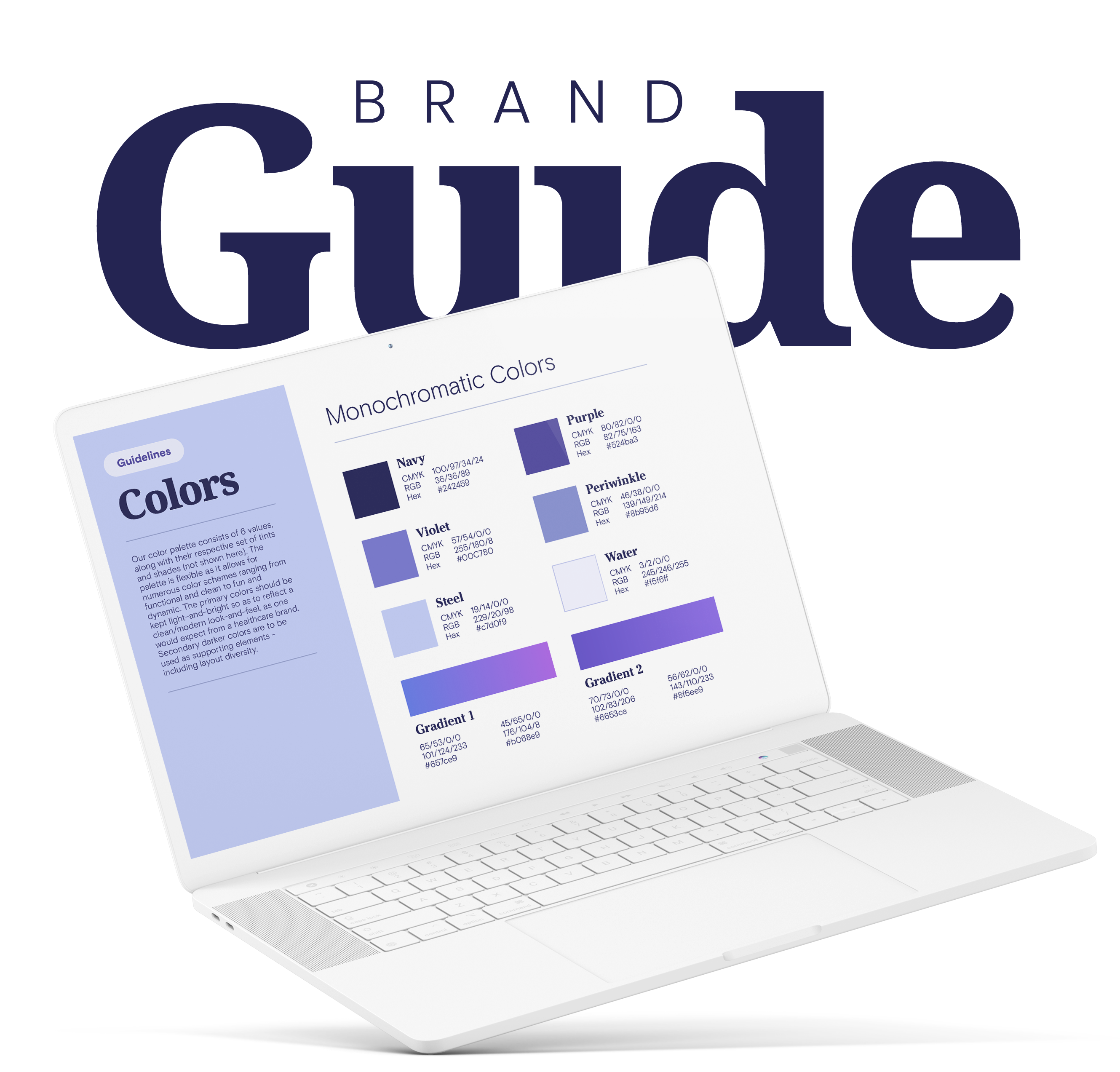
Colors
Our color palette consists of various shades of navy, purple, and blue. The palette can be paired with various shades of cool-grey and cool-whites. The primary colors should be kept light-and-bright so as to reflect a clean/modern look-and-feel, as one would expect from a healthcare brand. Secondary darker colors are to be used as supporting elements – including layout diversity.
Monochromatic Colors
Navy
| CYMK | 100/97/34/24 |
| RGB | 36/36/89 |
| HEX | #242459 |
Purple 1
| CYMK | 50/54/0/36 |
| RGB | 81/75/163 |
| HEX | #514BA3 |
Purple 2
| CYMK | 46/42/0/22 |
| RGB | 107/115/198 |
| HEX | #6b73c6 |
Periwinkle
| CYMK | 36/29/0/0 |
| RGB | 159/171/233 |
| HEX | #9FABE9 |
Steel
| CYMK | 19/14/0/0 |
| RGB | 199/208/249 |
| HEX | #C7D0F9 |
Water
| CYMK | 5/4/0/3 |
| RGB | 234/237/247 |
| HEX | #EAEDF7 |
White
| CYMK | 0/0/0/0 |
| RGB | 255/255/255 |
| HEX | #FFFFFF |
Gradient 1
| CYMK | 80/82/0/0 | 63/57/0/0 |
| RGB | 81/75/163 | 121/122/210 |
| HEX | #514BA3 | #797AD2 |
Gradient 2
| CYMK | 70/73/0/0 | 56/62/0/0 |
| RGB | 102/83/206 | 143/110/233 |
| HEX | #6653CE | #8f6EE9 |
Photos
Clean, minimal, and single subject photography defines the Recuro brand. All photos should include a cool-tone (or a blue hue). Backgrounds should include negative space so as to allow content to be overlayed ontop of photos. The link below will take you to our library of photography – please note: these photos have not yet been color corrected, nor cut out from their backgrounds. These photos should purely be used for visual reference. Please contact [email protected] for any photo editing assistance.
Clean, Minimal, Whitespace

Isolated Subjects:
When possible, cut out subjects to have a clean background.

Mobile Devices:
When possible, photography should include mobile devices.

Natural & Candid:
Patient photography should be positive, inviting, and candid.

Diversity & Inclusion:
Diverse photos should always be used to reflect real-life subjects.

Minimal Backgrounds:
Backgrounds should be minimal and have a primary focus.

What to Avoid:
Avoid complex backgrounds, stylized warm colors, or photos with multiple subjects.
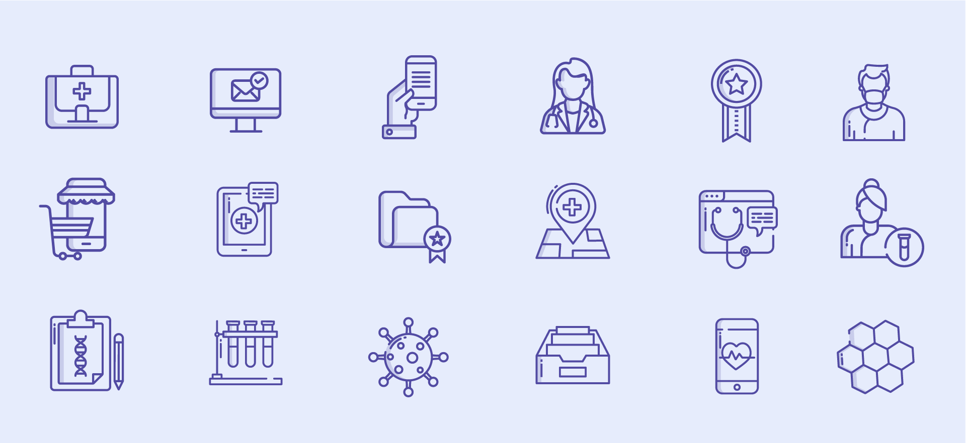
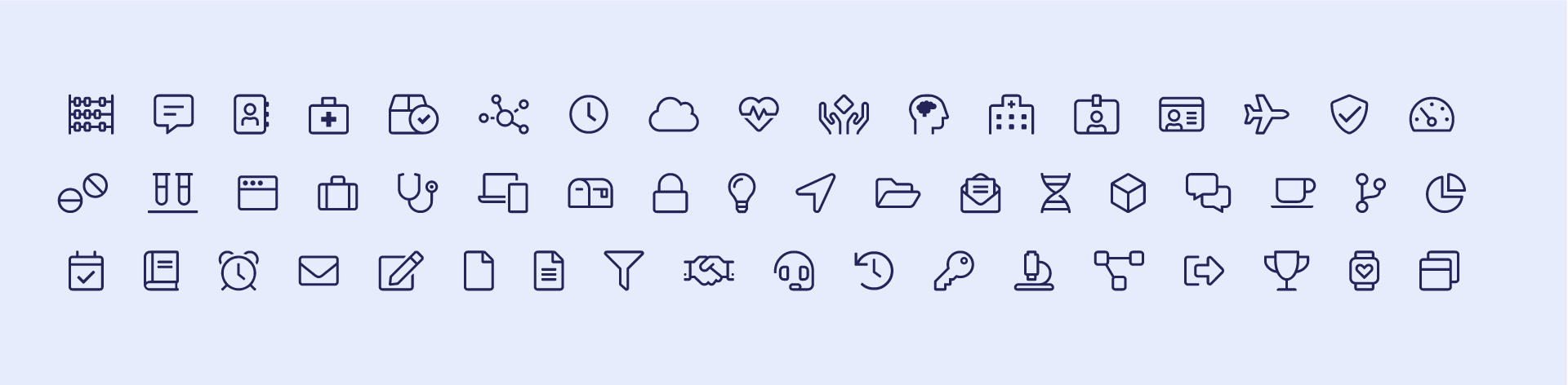
Icons
The Recuro brand utilizes 2 distinct icon styles – Duotone Icons, and Font Awesome icons. White both libraries are extensive we have direct control over the duotone icon set. These icons can be customized and built to communicate conceptual ideas across marketing materials. The Font Awesome library should be used for mobile and web applications when available. The library offers a variety of icon styles – however when possible, please use the “Light” weight font set so as to mimic our other icons across UI elements.
Icon Libraries & Line Weight
Dualtone Icons:
Full Icon Library: www.flaticon.com/authors/icongeek26/outline-colour
Font Awesome Icons:
Full Icon Library: https://fontawesome.com/v5/cheatsheet/pro/light
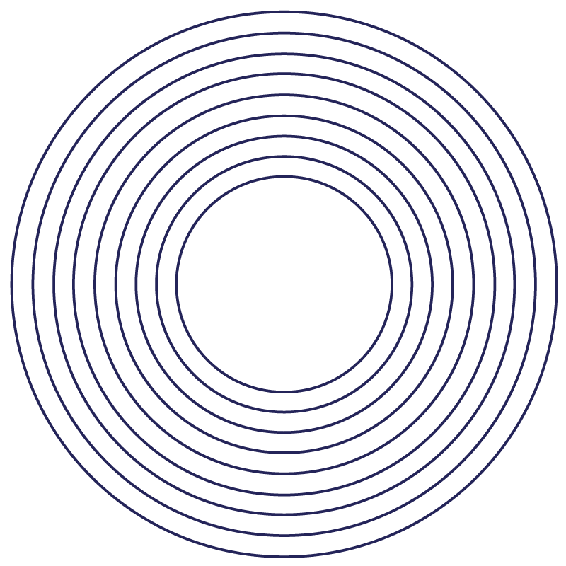
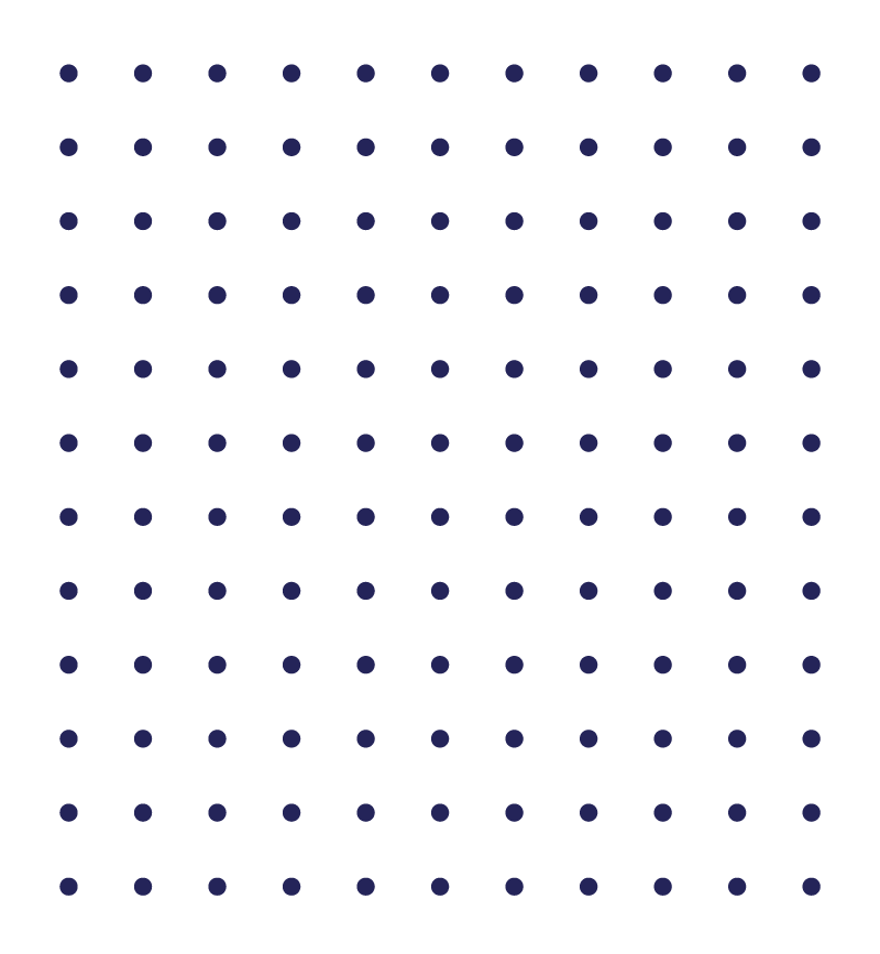
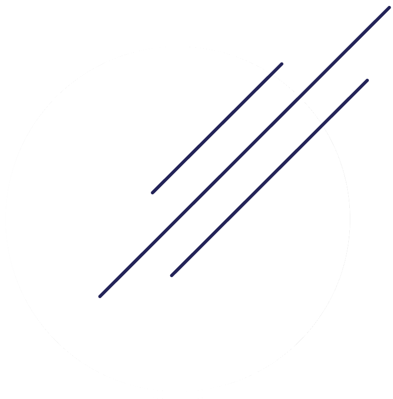
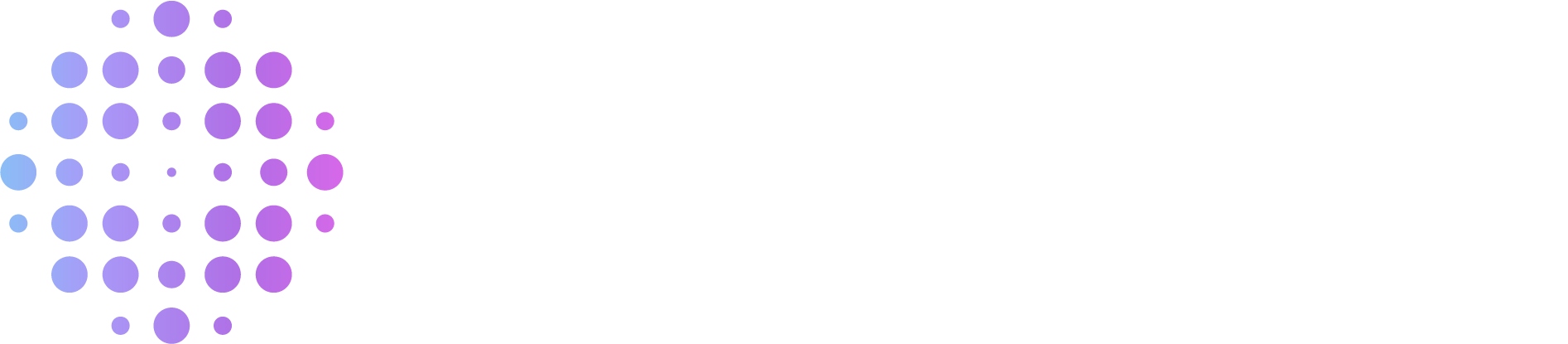
Patterns
Layering elements plays a huge part in various Recuro layout treatments. Overlapping geometric shapes create a sense of depth and movement. Below are some commone elements which are used throught the branding.
Styling & Treatments


Grids
In order to create a consistency across all web and print material, Recuro utilizes a rigid grid system to establish what is known as a Fibonacci sequence of content.
Balanced Grid System

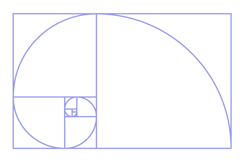
Fibonacci Sequence:
The Fibonacci sequence is a design system based on mathematical balance. As a result, the audience feels at peace, even if a layout may appear asymmetrical. The sequence itself begins with 1 and scales exponentially spiraling outwards – thus increasing in size and simplicity.
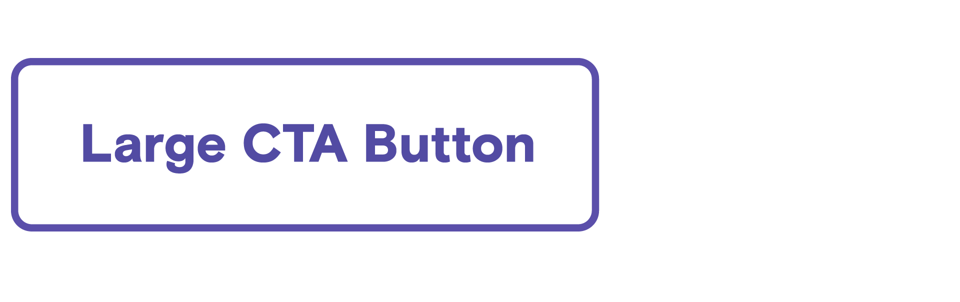
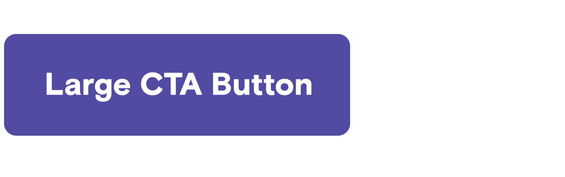
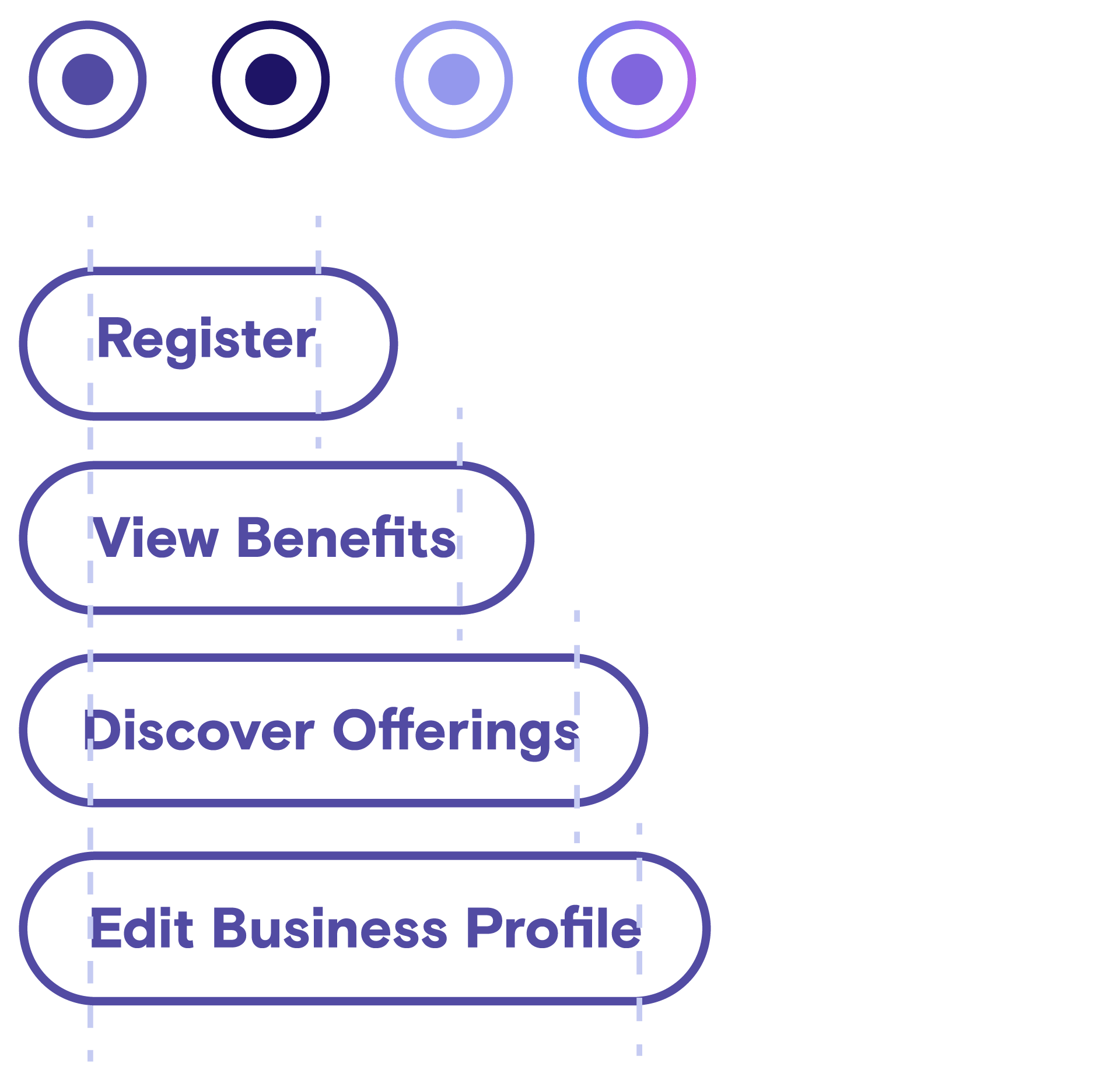
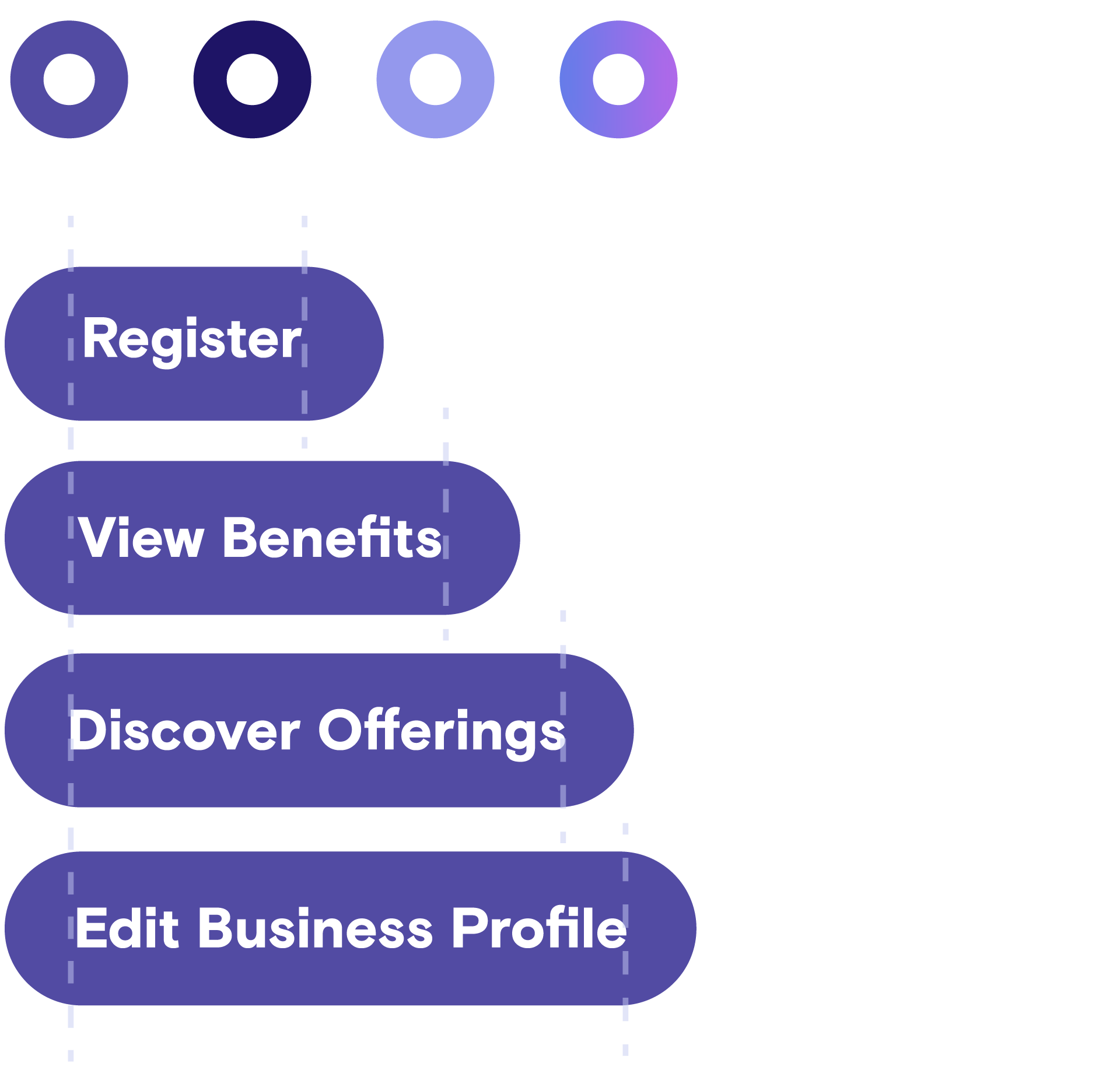
Buttons
All buttons should contain rounded corners. Depending on the size of the CTA button, the rounded corners may vary depending on scale. A good rule of thumb is for regular buttons, set the border-radius to 100%. For larger buttons, set the border-radius to 5px. Large CTAs should be used seldomly as they are reserved for higher visibility landing page conversions.
CTAs & Rounded Corners
Large CTA: Static
Large CTA: Hover
Regular Button: Static
All static buttons should be transparent with a solid stroke. All regular buttons should have 100% rounded corners.
Regular Button: Hover
All button hover states should be a direct inversion of their static colors. Interior padding on all buttons should be maintained.
